
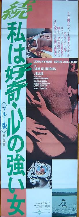
The sequel's advertising is here represented by a tatekan, the larger of the Japanese paper with two standard B2 panels joining to measure a beautiful tapestry at 20" x 58" or 50cm X 147cm.
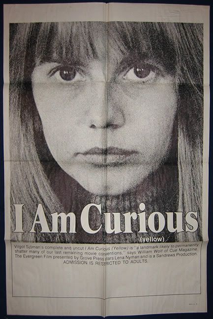
I'm not sure but I am curious, green(wood).
Don't be afraid to ask questions if you're not sure.
2 comments:
wow - that japanese banner style is stunning!
btw I showed the summer in the city poster to a group of friends (male) the other night and their jaws dropped, my sister, who was there just laughed and said it was just silly....
agreed. i have some pinky violence ones that are beyond beautiful and possibly even remarkably so. they design a fabulous poster there, i find.
she's right. i mean, at first it has to be mildly shocking but then the context of it being outrageous on purpose takes over and it doesn't seem so serious.
Post a Comment