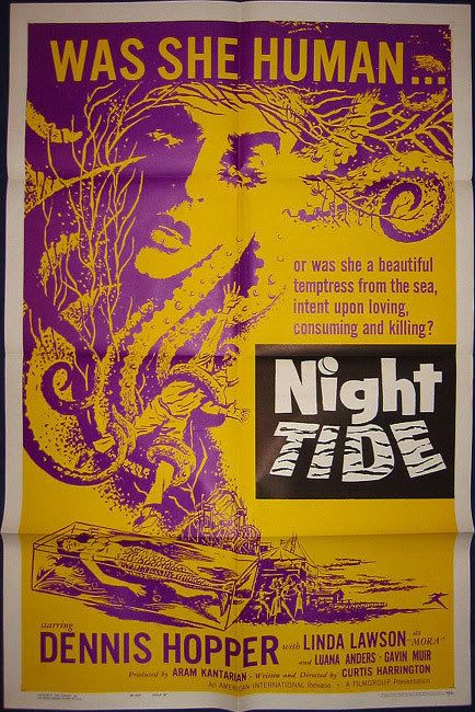
So, when it came to selling Harrington's 1961 movie, Night Tide, the studio faced the, possibly profitable, fact that they would potentially be dealing with two distinct groups of moviegoers. First there would be the standard types who go to see supernatural thrillers/horrors and such and they could well be approached with a nice, garish poster promising thrills of their type as seen by the 'style A' one sheet here.

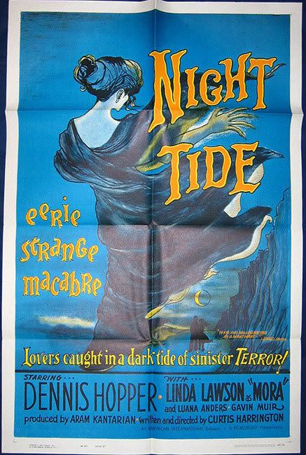
The other realistic faction of fans for the film would be those that had followed his earlier, more artsy work and his associations with Kenneth Anger and the movie-worlds' more avant-garde group of filmmakers. They were heralded into their cozy little arthouses with the much more beautiful and chilling 'style B' that we see here. A poster, I must add, that is much rarer (as well as just plain strikingly designed) than the alphabetically earlier style and therefore highly coveted in the collecting world and I was much pleased when I finally acquired mine for a reasonable sum. And it's mint, y'all.

Now, wasn't that a fascinating look into how movie advertising is created and stuff? I couldn't agree more.

No comments:
Post a Comment