What could be better than hearing stories about Menahem Golan and John Ford as told by Lee Marvin?

Thursday, February 26, 2009


Tuesday, February 24, 2009
Hausu!!!
What? Still not at all interested?
If I had seen this in 1977 I would have been scarred for life.
Monday, February 23, 2009

a year ago the fires raged
Roughly, a year ago, Toronto lost the Queen Street West location of Suspect Video, along with several other businesses. Hard to believe it was a year. Nothings happened with the space. Just rubble and memories.


 Here is the post about the original tragedy.


 Here is the post about the original tragedy.

Inside the pink cinema
 No, I don't mean that kind of pink cinema, I mean this kind of pink cinema. Pal of Sticky Floors, Jason Gray posted about his experience going to one of the remaining pink cinemas in Tokyo over at his blog. You can also see some of the buildings in their surroundings in this post of his.
Sunday, February 22, 2009


return of the puffy monsters
I promised Deadilicious that I would post pics of the kooky illustrated board that the monster stickers were stapled to (see earlier post). Here it is in all its glory.


Saturday, February 21, 2009
Thursday, February 19, 2009
we got Dardos!
 Wow! We'd like to take a bow for the recognition of being presented with The Dardos Award twice, first by those swell French pastry chefs over at Deadilicious, and then by Samuel at MONDO 70: A Wild World of Cinema! Wow! What an honour!
"The Dardos Award is given for recognition of cultural, ethical, literary, and personal values transmitted in the form of creative and original writing. These stamps were created with the intention of promoting fraternization between bloggers, a way of showing affection and gratitude for work that adds value to the Web."Like a chain letter awards, we must pass the award over to five other blogs that we like. We put our heads together, had to pull some short straws, but came up with these WINNERS!
 The Undead Film Critic - Sadly, what since the time that me and the lads picked our winners, one of them is no more. While there is no set order to the awards, we would very much like to single out The Undead Film Critic, whose time with us was far too brief. I checked it daily and his flurry and variety of visual posts was a source of constant delight. I was away from regular internet access earlier this month and when I sat down to catch up on what UFC had been up to, I found that Blogger had pulled the plug on his blog which upset me to no end. We have heard from him since and he promises this:
"It might be awhile but I shall return. Zombies don't die, but we sure are slow as hell."Please stay tuned at the end of this blog for some photos of UFC in happier days. The Scandy Factory posted an obit here.

 The Shoot Actors Don't They
A bunch of Toronto nerdlingers stand on a soapbox and spout off on what they like and love about movies. The Finnish love them.
 Cinebeats: Confessions of a Cinephile
" One woman's love affair with '60s & '70s era cinema."
It's been awhile since she posted, but when she does, we snap to it and read it!

I compare this blog to a desk day calendar that regularly inspires me from others endeavours and greatness. Simple, no frills and that's all you need. (It also has Cinebeats' Kimberly Lindbergs as a contributor.
The Dardos Award Rules are:
1) Accept the award by posting it on your blog along with the name of the person that has granted the award and a link to his/her blog.
2) Pass the award to another five blogs that are worthy of this acknowledgement, remembering to contact each of them to let them know they have been selected for this award.And now some memories of UFC.
(Lights dim and fade in "We've Only Just Begun" by The Carpenters)
(Lights dim and fade in "We've Only Just Begun" by The Carpenters)


Thursday, February 12, 2009
R.I.P. Shirley Jean Rickert
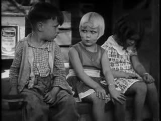
One time Little Rascal and then, later, burlesque queen, Shirley Jean Rickert passed away last week just a month before her 83rd birthday.
She wasn't a star or regular in the Our Gang shorts but you may recall her, as I did, as that little blonde girl with the distinctive curls. Good hair!
I'm not too pained to bring you this news since I really don't know much about her and wouldn't have at all if not for the help of a hip poster seller from California (it's rumoured he used to date Mary Woronov!) who I arranged a trade with and my end included this beast of a 40" X 60' poster affixed to heavy cardboard and showing obvious signs of loving use and stamps indicating that it was property of the Sonney Amusements family of roadshow film exhibitors. Great history for people like me!
Anyway, here she is in all her fancy-dancing glory on the bottom right hand corner of the poster...
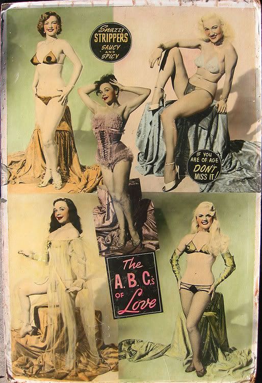
If you visit me, you can look at her more closely (but not one-on-one) as you remove your shoes.
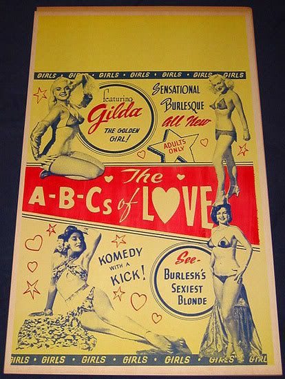
And here's a window card for the same film. These pieces are no longer created for contemporary movies but they used to be quite popular at one time. 14" x 22" with a space for the theatre to write in the specifics on show dates and times. They'd be posted about small towns and such in storefront/diner windows or community boards...that type of thing.
Shirley was known, on stage, as Gilda.
Comely, to say the least.

She wasn't a star or regular in the Our Gang shorts but you may recall her, as I did, as that little blonde girl with the distinctive curls. Good hair!
I'm not too pained to bring you this news since I really don't know much about her and wouldn't have at all if not for the help of a hip poster seller from California (it's rumoured he used to date Mary Woronov!) who I arranged a trade with and my end included this beast of a 40" X 60' poster affixed to heavy cardboard and showing obvious signs of loving use and stamps indicating that it was property of the Sonney Amusements family of roadshow film exhibitors. Great history for people like me!
Anyway, here she is in all her fancy-dancing glory on the bottom right hand corner of the poster...
If you visit me, you can look at her more closely (but not one-on-one) as you remove your shoes.
And here's a window card for the same film. These pieces are no longer created for contemporary movies but they used to be quite popular at one time. 14" x 22" with a space for the theatre to write in the specifics on show dates and times. They'd be posted about small towns and such in storefront/diner windows or community boards...that type of thing.
Shirley was known, on stage, as Gilda.
Comely, to say the least.
Wednesday, February 11, 2009
Tuesday, February 03, 2009
Kilka dobrych polskich filmow plakaty
Some of my favourites...

Solaris

Blade Runner
 Missing
 Yesterday's Enemy
 El Topo
 Something Wild
Sunday, February 01, 2009
What recession?

Wednesday, January 28, 2009
Tuesday, January 27, 2009
polish poster haters
So we've posted images of fab Polish posters and other variations on poster design, so this decent gallery at wellmedicated.com is nothing new. What is fascinating is the over 300 comments about the post, particularly the people who call these posters garbage. Thanks internet. Thanks for giving these morons power. I've excerpted some of the choice comments below as well as some positive ones.
 Straight Time
 The Changeling
 Critters
 Don't Look Now
 Short Circuit 2
 Enter The Dragon
Bukator - August 23rd, 2008
Are u ppl blind? These are garbage. It looks like they were drawn with pencil crayons and markers by a ten year old. We live in a world of photoshop now. These poters look to be drawn in Microsoft Paint. Get with the times man. I like vintage design just as much as anyone else but these are just terrible excuses for art. Very lazy designs here that seem to be whipped up in minutes by whoever created them. If this is what it looks like throughout Poland, then they are missing out big time.
jkillah1 - August 25th, 2008
Many of you may call these “art”, but maybe you are just giving them too much credit because they are old. To me, they just remind me of all those dirty, boring, drab things from decades ago. Like watching TV shows from the early 90’s.
I love good art, and don’t get me wrong. The modern hollywood posters are not that great, but at least they have some vibrant color!
Nowadays, all that these posters would do is depress people and make them think that the films were boring! I’m surprised that so many people like these. It just gives me a sinking feeling in my gut. Uggh!
Atama - September 14th, 2008
i thought some of these were really good,but most of them were just disgusting. the never ending story one for instance is lazy and uninspired. i mean really,its like the guy was commissioned,and the day before it was due,he got drunk and watched the movie and then doodled what he remembered the next morning while eating breakfast before he went to drop it off. the Gandhi one,though,was absolutely beautiful. very Dali-esque. but to call any of these posters better than American ones is pretty off,one because that’s a pretty broad opinion,and two,because every one of these paintings is completely and utterly destroyed by Drew Struzan and folks of his caliber. still very nice and interesting though:D
The Final Word - September 15th, 2008
It’s frustrating (though not surprising) to see the negative comments on this board. It’s too bad that so many folks are so put off by the unfamiliar, when we should all be embracing it. These are all truly remarkable pieces.
To those who suggest that these are poorly drawn: You’re foolish.
To those who suggest that these were created to skirt copyright: You’re incorrect. They were created because, believe it or not, America’s design sensibility is neither universal nor supreme. Poles respond to advertising that reflects their sensibilities, as they should.
Haters hate. Playas play.
John Peter Paul - September 19th, 2008
I grew up in Poland in 70’s and 80’s. These posters represent the dominant artistic mood of the whole country at that time. We listened to dark and complex music, we valued deep literature, we were a rather somber and serious culture- with a romantic twist. It was a direct reflection of political and economic suppression as well as the result of very dominant catholic religious culture. We also looked to England, Italy and France more than the USA for artistic direction and inspiration.
Things have changed since, but to look back at those posters brings back some good and some not so good memories.
As to the colors, the repro and printing technology was not great. Also, some of the posters were well aged by the time they were digitized for display here
Straight TimeThe ChangelingCrittersDon't Look NowShort Circuit 2Enter The DragonBukator - August 23rd, 2008
Are u ppl blind? These are garbage. It looks like they were drawn with pencil crayons and markers by a ten year old. We live in a world of photoshop now. These poters look to be drawn in Microsoft Paint. Get with the times man. I like vintage design just as much as anyone else but these are just terrible excuses for art. Very lazy designs here that seem to be whipped up in minutes by whoever created them. If this is what it looks like throughout Poland, then they are missing out big time.
jkillah1 - August 25th, 2008
Many of you may call these “art”, but maybe you are just giving them too much credit because they are old. To me, they just remind me of all those dirty, boring, drab things from decades ago. Like watching TV shows from the early 90’s.
I love good art, and don’t get me wrong. The modern hollywood posters are not that great, but at least they have some vibrant color!
Nowadays, all that these posters would do is depress people and make them think that the films were boring! I’m surprised that so many people like these. It just gives me a sinking feeling in my gut. Uggh!
Atama - September 14th, 2008
i thought some of these were really good,but most of them were just disgusting. the never ending story one for instance is lazy and uninspired. i mean really,its like the guy was commissioned,and the day before it was due,he got drunk and watched the movie and then doodled what he remembered the next morning while eating breakfast before he went to drop it off. the Gandhi one,though,was absolutely beautiful. very Dali-esque. but to call any of these posters better than American ones is pretty off,one because that’s a pretty broad opinion,and two,because every one of these paintings is completely and utterly destroyed by Drew Struzan and folks of his caliber. still very nice and interesting though:D
The Final Word - September 15th, 2008
It’s frustrating (though not surprising) to see the negative comments on this board. It’s too bad that so many folks are so put off by the unfamiliar, when we should all be embracing it. These are all truly remarkable pieces.
To those who suggest that these are poorly drawn: You’re foolish.
To those who suggest that these were created to skirt copyright: You’re incorrect. They were created because, believe it or not, America’s design sensibility is neither universal nor supreme. Poles respond to advertising that reflects their sensibilities, as they should.
Haters hate. Playas play.
John Peter Paul - September 19th, 2008
I grew up in Poland in 70’s and 80’s. These posters represent the dominant artistic mood of the whole country at that time. We listened to dark and complex music, we valued deep literature, we were a rather somber and serious culture- with a romantic twist. It was a direct reflection of political and economic suppression as well as the result of very dominant catholic religious culture. We also looked to England, Italy and France more than the USA for artistic direction and inspiration.
Things have changed since, but to look back at those posters brings back some good and some not so good memories.
As to the colors, the repro and printing technology was not great. Also, some of the posters were well aged by the time they were digitized for display here
Monday, January 26, 2009


Sunday, January 25, 2009


Subscribe to:
Posts (Atom)